

Your competitors are already building with AI! Find out if your data, processes, and team are ready before you fall behind. Take the AI readiness assessment today.
eCommerce
Align brand identity and user experience in eCommerce with actionable tips on motion, microcopy, trust signals, and checkout design.
%2015.45.56.png)
In eCommerce, brand identity is what customers feel while navigating your store. A logo, color palette, or slogan can spark recognition, but the real strength of a brand shows in micro-interactions: how a button responds when pressed, the tone of a checkout message, or the reassurance a shopper gets before entering payment details. These details decide whether your brand feels trustworthy, consistent, and memorable. When brand identity and user experience don’t align, customers notice immediately. A premium-looking brand paired with slow load times loses credibility. A friendly product page voice followed by a rigid checkout creates friction that leaves a lasting impression. But when every element, from navigation to microcopy, extends your brand values, you build an environment where customers not only buy but also return, recommend, and trust. This article explores best practices for aligning brand identity with UX in eCommerce. We’ll dive into how interaction rules can reflect your brand personality, how trust should be built into key moments, and how performance, personalization, and experimentation all play a role in shaping perception.
Logos and colors aren’t enough. Translate your brand personality into concrete interaction rules, such as how components space, animate, and react under stress. Define a motion language with speed, easing, and direction that matches your brand’s voice. A calm brand may decelerate in animations, while an energetic one might snap and rebound. Write these rules into your design system alongside color and typography so every new page inherits the same behavior, not just the same look.
Your brand’s tone should be most visible where risk feels highest: add-to-cart, payment, returns, and error states. Replace generic labels with purpose-driven language that reduces anxiety. For example, “Secure checkout” feels more reassuring than “Checkout.” Place reminders like “Free 30-day returns” close to call-to-action buttons. Calibrate tone by context: reassuring during checkout, bold in product discovery, and concise in errors. Maintain a tone-of-voice matrix so product, marketing, and support copy never drift apart. You can make sure to analyze the current trends in order to understand the market better.
Trust should not be reduced to a badge at the bottom of the page. Instead, weave trust signals into the moments where doubts naturally arise: card fields, shipping method selection, and returns. Use recognizable seals, clear SSL indicators, and nearby policy statements alongside real customer reviews. These reduce perceived risk exactly when the user feels uncertain. Test which seals, review placements, and wording actually lift confidence for your specific audience.
If your brand champions curation, navigation should highlight stories, lookbooks, and product edits. If it celebrates breadth and value, prioritize faceted search and strong category hierarchies. Align taxonomy with the language your customers use, not only with how you organize inventory. The homepage still serves as the anchor of perception for many visitors, so its structure should reflect your brand’s promise through layout and hierarchy, not just hero images.
Personalization should strengthen brand identity rather than fragment it. Set clear guardrails for what can adapt, content order, offers, or product highlights, and what must remain consistent, such as tone, motion, and primary colors. Use your design system as the palette for personalization, then feed it with customer signals. Validate that personalized experiences improve both conversions and brand fit, rather than chasing only short-term clicks.
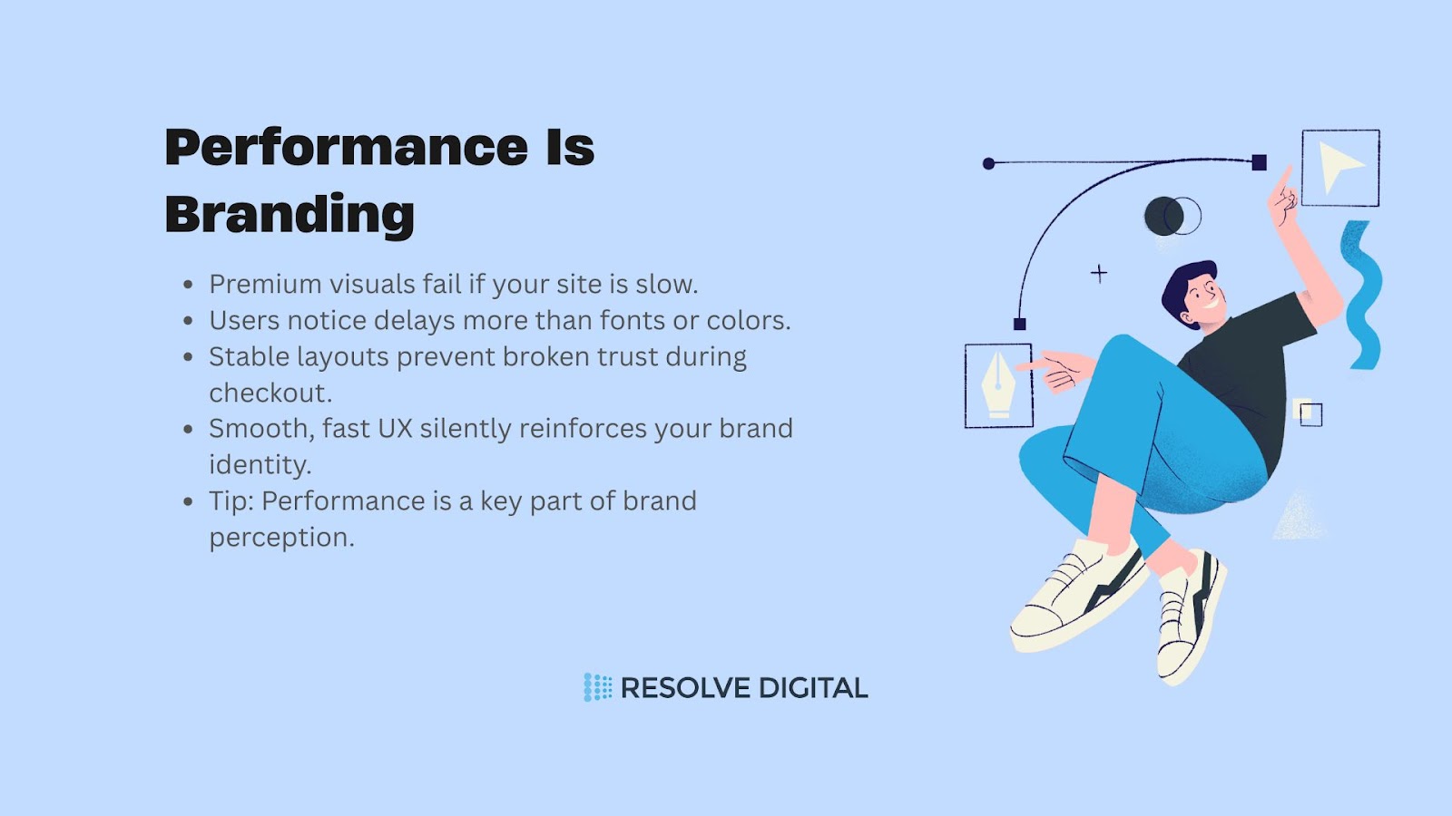
Speed, stability, and readability define how your brand is perceived. A so-called premium brand that lags during checkout or shifts layouts feels less credible regardless of typography or color choices. Create a performance budget within your design system with rules for image weights, font loading, and page stability. Audit product and checkout pages to eliminate layout shifts and blocked interactions, since users remember delays more vividly than decorative details.
A component library prevents chaos, but a brand system creates coherence. Document brand tokens like typography scales, color roles, spacing, and radius. Capture interaction principles such as focus states and motion, as well as copy guidelines for calls-to-action and error messages. Include examples of signature brand moments, such as celebratory order confirmations or wishlist interactions, so teams consistently ship experiences that feel unified and recognizable.
Place credibility cues where cognitive friction is highest. Delivery times should appear above shipping selectors, “why we ask” explanations should sit near sensitive fields, and social proof should be displayed close to price and variant selections. Friction itself can be useful: a confirmation step for high-ticket items can increase trust because it signals thoroughness. Map these techniques to your brand stance, keeping them subtle for minimalist brands and more descriptive for advisory brands.
Checkout should reflect your brand while minimizing distractions. Reduce visual clutter, use brand typography and primary color for call-to-action buttons, and soften the surrounding palette to keep users focused. Present security cues directly beside payment inputs and write inline validation messages that are polite and human. A calmer visual design paired with a warmer voice preserves brand identity while reassuring users of safety.
Brand identity should not end at order confirmation. Confirmation pages and emails should reflect your brand voice while offering clear next steps, such as tracking, care instructions, or sizing help. Provide branded support channels and self-serve returns that are transparent and predictable. Easy-to-use return flows communicate confidence and respect, which often build more loyalty than marketing campaigns.
Localization is more than translation. Adapt product filters to match local shopping behaviors, convert sizing systems automatically, and reframe assurance messages based on regional risk perceptions such as delivery reliability or payment security. Keep constants such as tone, motion, and call-to-action styles intact so the experience feels both native and unmistakably part of your brand.
Winning an A/B test on clicks is not enough if the variation erodes brand trust. Define a checklist that evaluates whether new experiments preserve tone, respect motion guidelines, and maintain accessibility. Include a “brand fit score” in experiment reports alongside conversion and revenue results. This prevents gradual erosion of brand identity through isolated optimization.
Track a balanced scorecard that includes task success, perception metrics like trust and clarity, and brand recall of key messages. Tag events by component or token to trace performance back to brand system decisions. This way, incremental eCommerce UX development changes can be connected to long-term brand equity, creating measurable alignment between design and identity.
Start by mapping your user journey from browsing products to completing a purchase. At each step, examine whether your tone is consistent with your brand promise, whether trust signals appear exactly when users feel hesitation, and whether motion feels deliberate or random. Go beyond visuals, check how long-loading assets affect brand perception, how error states are worded, and how transitions support or break confidence. This type of audit should reveal hidden mismatches, like a playful product page voice followed by a cold, transactional checkout screen, or a strong brand aesthetic slowed down by poor performance.
A brand-focused design system should capture more than typography and buttons. Document motion standards such as easing curves and transition speeds, set rules for trust indicators like placement of security icons and policy statements, and define voice patterns for labels, prompts, and confirmations. Add performance budgets that prevent oversized images or heavy scripts from slipping into production. Create a living repository of copy rules that ensure terms like “Buy Now” versus “Add to Bag” remain intentional and aligned with brand positioning. This step ensures brand expression is no longer subjective but codified into reusable patterns.
Rather than overhauling the entire website at once, identify moments where users are most vulnerable to doubt or friction, checkout forms, shipping details, and empty states. Introduce inline assurance modules that clearly highlight secure payment, fast delivery, or easy returns at the exact point of decision. Refine the tone of empty states so they encourage further exploration instead of dead-ending the user. Measure the impact of these changes not just on conversion rates but also on perceived brand alignment. By piloting in focused areas, you create visible wins without overwhelming development or design teams.
As your team begins experimenting with personalization, ensure those changes never compromise the brand identity. Define guardrails that lock in non-negotiables such as voice, motion rhythm, and accessibility, while allowing flexibility in content order, imagery, and offers. Set up experiment governance rules that include a “brand fit review” alongside traditional conversion metrics. This prevents growth initiatives from introducing dark patterns, overly aggressive messaging, or disjointed visuals that harm brand perception in the long run. Scaling with guardrails allows teams to innovate freely while keeping brand integrity intact.
At Resolve Digital, we believe eCommerce UX is where brand identity truly comes alive. Our team specializes in translating your brand personality into seamless digital interactions, from navigation flows and checkout design to microcopy that reassures customers at the right moments. We have partnered with businesses across industries to craft experiences that are not only visually consistent but also emotionally resonant, ensuring every interaction reinforces trust and loyalty. With decades of expertise in building scalable, brand-aligned eCommerce platforms, we bring structure, creativity, and measurable impact to every project. If you are ready to align your brand identity with a user experience that drives both conversions and long-term customer trust, contact us today, and let’s make it happen by discussing strategies on a free strategy call!
The right partnership can help you elevate your online presence and grow your business by attracting your dream customers. Whether you're looking to develop a luxury eCommerce store from scratch, improve your existing site, or migrate to a different platform, Resolve Digital can help you succeed. Get in touch to learn more about our end-to-end eCommerce services!